Identity
UI/UX
Prototyping
Digital Product Design
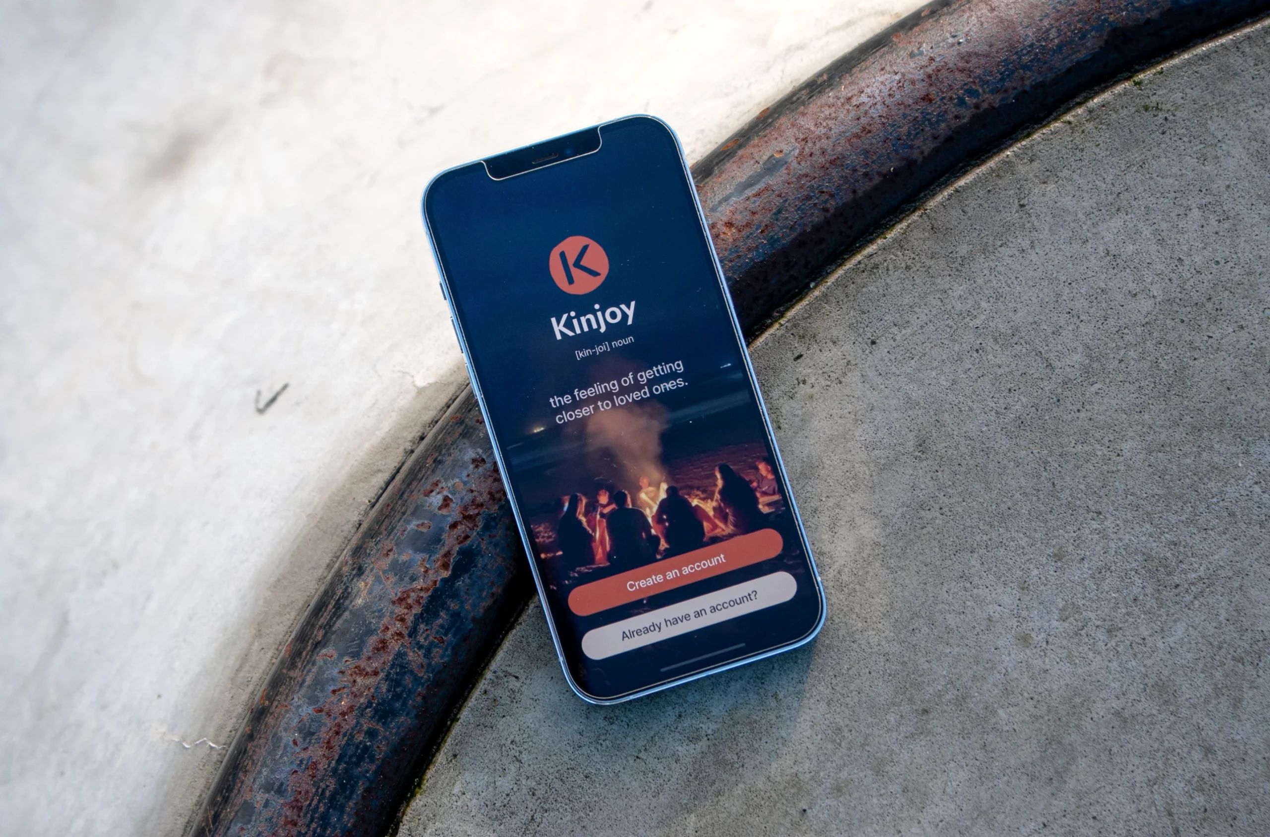
Building and launching an app to capture memories and preserve the voices of our friends and family.
In 2022 I teamed up with 2 friends to create Kinjoy, a digital space for preserving memories through asynchronous voice messages. As the first designer I brainstormed on the service, why and what it could be. Then I proceeded to create the logo, the visual identity, and the design system, combining hand-drawn elements with neo-grotesque type and a warm, community-centered palette. I developed the brand’s responsive components in Figma and collaborated on user flows to ensure an intuitive experience of memory sharing. Kinjoy launched on Google Play and incubated at Kedge Entrepreneurship.
Insights
From idea to partnership
It started with a message in WhatsApp. Late fall 2022 I reached out to one of my friends with a suggestion to collaborate - I was not sure on what, but soon my friend send over a rough, written draft of a side project of his. It talked about an “audio memoir sanctuary” for “close ones” in the form of an app named Kinjoy. Excited about the oppertunity to work on an audio-visual project, I setup a new Figma team and started throwing ideas around from a behavioral design perspective. New thoughts about a potential peripheral emerged while the objective of allowing people to record, store and share audio-based memories crystallized.
Why Kinjoy?
Over the next copule of weeks we bounced ideas off each other in ad-hoc brainstorming sessions in Figma. At this stage I found it highly useful to highlight potential Why’s of the service - why would it matter to people? Out of all the reasons for launching Kinjoy these were the most important: 1) To help people develop the habit of sharing good memories. 2) To build a library of the good memories shared. 3) To help people value the emotionnal load contained in a voice. 4) To receive audio memos from kins and be able to add up to it or share brand new ones.
First team-member
A UX designer was presented with the with the more polished idea and pitch during a hackaton in spring 2023. She created an affinity diagram, an emotional journey map, an information architecture diagram and a range of wireframes and potential user flows for the product. This really started to form the concrete user experience for our digital product.
The beginning of a visual identity
In April, I began exploring concepts for a potential visual identity. At this point our small team of 3 regularly talked on Slack and a Notion page had been created for task management. At the early, exploratory stage of the identity I collected various references and grouped them into 8 different directions, each emphasizing a certain aspect of the service that appealed to specific sub-segments of potential users. In the end I decided to lean towards an angle characterized by 'warm', analogue, and handheld techniques. We frequently reffered to the ideal scenario where a group of friends sit around a bonfire on the beach, exchanging memories. Given our two main-segments are cross-demographic, cross-generational groups of family members and friends the identity had to emit ‘closeness’, trust, warmth, a bit of nostalgia, and comfort.
Sketching the logo
From the outset I knew the logo should contain a typographic mark - logically it would center on the prominent, first letter of the name, “K”. One direction pursued a visible distinction between “Kin” and “Joy” inspired by brands that also use a combination of two words: BeReal, SnapChat, YouTube, Facebook, Netflix. Eventually this pulled the brand in an undesirable direction of more commercial, vast, techy platforms roamed by ads and ai. A second direction intentionally used serifs to communicate nostalgia and a third direction employed the “O” of joy as a symbol of unity and connectedness. Based on the initial exploration and feedback from the team I decided to move forward with four different sketches to refine and explore what the typographic symbol could look like. I did not limit the continued logotype-exploration to narrow nudges or tiny adjustments of the 4 chosen sketches, but sought to create wildly different and new variations. A notion of the “new ancient” and “native iconography” emerged from these solutions, but I still could not find a concept that felt right.
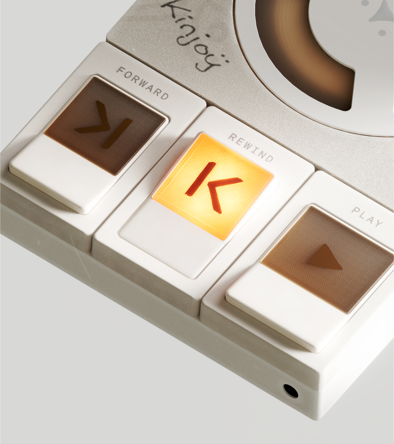
The logo concept
A point arrived where I left the laptop and started sketching in charcoal, nail polish and gouache true to the initial idea about handheld and analogue memory sharing. Soon, two dinstinct symbols surfaced: Two versions of the rewind arrow also found in any analogue or digital recording interfaces. Both symbols share one clear feature with the letter “K”: the “<“. Now that a clear concept had been found, it was just a matter of taming the guache and positioning the “<” the proper amount of pixels away from the stem so that it could both be interpreted as a rewind arrow and a “K” for Kinjoy.
Circling in on the final logo
After a legibility test I went ahead with two options - an organic slim version and a more geometric, machine-like version. Horizontal and vertical lockups with the name was tested and it turned out that the horizontal versions looked off with two K’s positioned next to each other. I drew some single-line circles using the same analogue tools - wood skewers and brushes and the organic circle in combination with the hand drawn K seemed more in balance although a bit of legibility was lost in the small sizes.
The final logo
Finally, I arrived at a solid, handdrawn circle. The final logo was made from a 1200dpi scanning of the two handdrawn elements: 1) the icon itself and 2) the circle. These two elements were then vectorized and cleaned up in Illustrator.
The visual identity
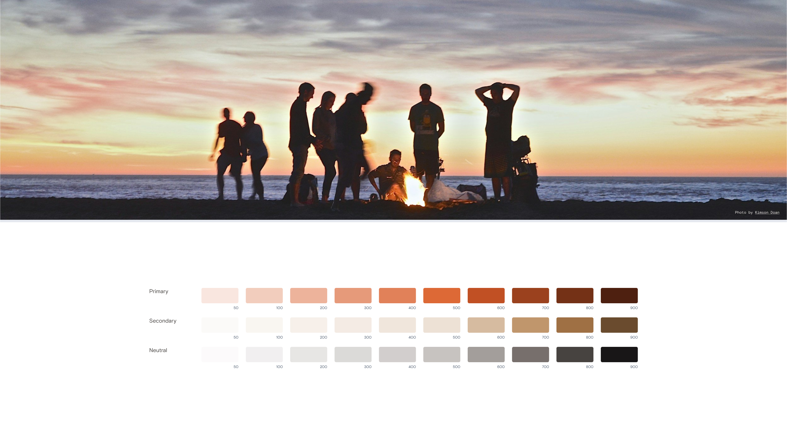
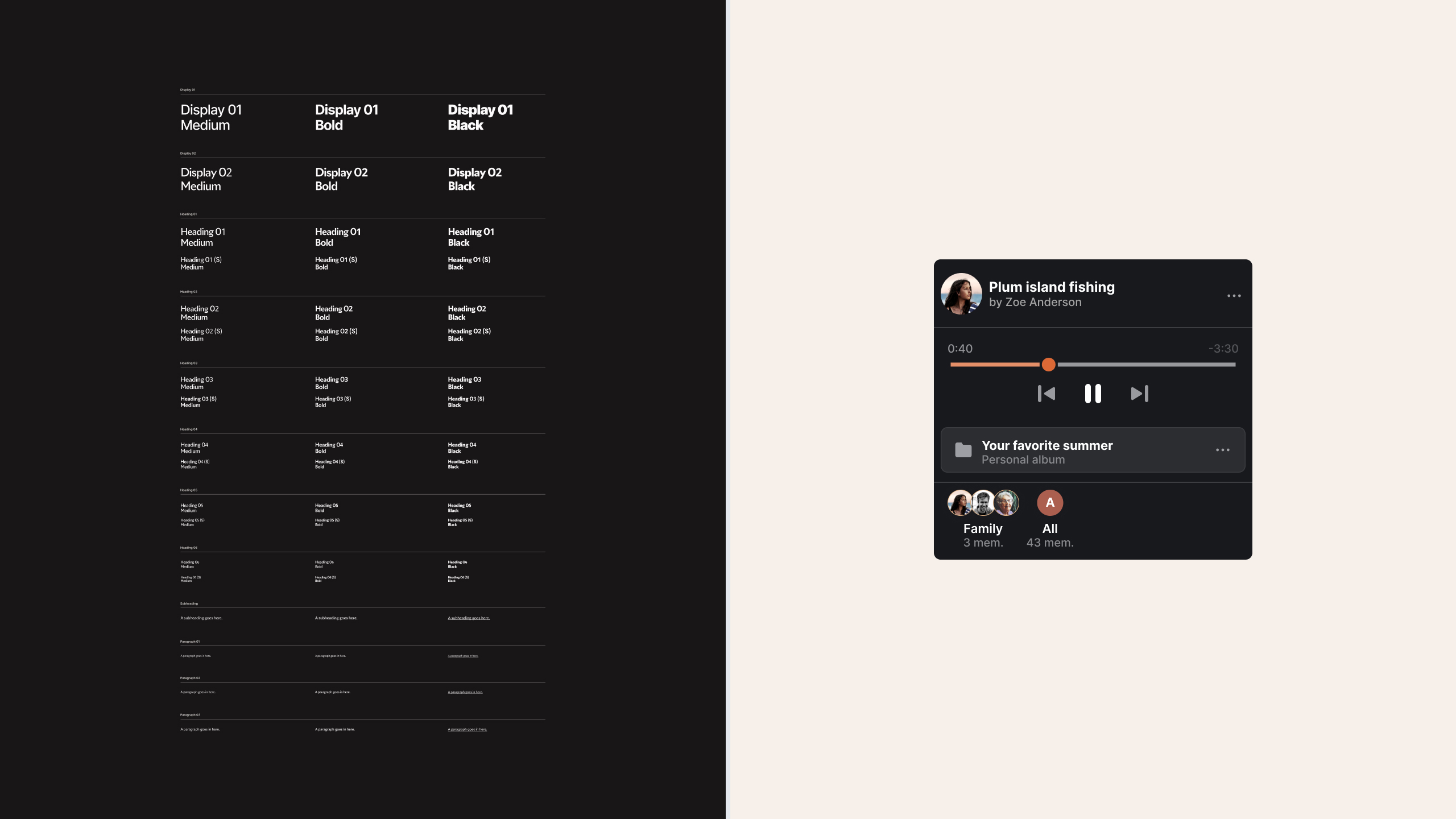
By the end of this process, a vision for the identity had come into sharp focus. The primary colors — vibrant orange and yellow — reflect the warmth of a campfire, a place where we come together to connect and share. The colors capture the inviting glow that brings people close and fosters a sense of community. The supporting colors are earthy tones that hint at inclusivity and a connection to our shared history and Earth. They evoke the spirit of ancient cave paintings, symbolizing the digital marks we create, share and leave behind to pass through generations. These colors and shapes are intentionally imperfect and transient, echoing the natural, hand-drawn quality of early human art. To balance the historical and organic feel, the font, Inter, has been chosen. Its clean lines provide a contemporary contrast to the more nostalgic elements, serving as an anchor that ties past and present together.
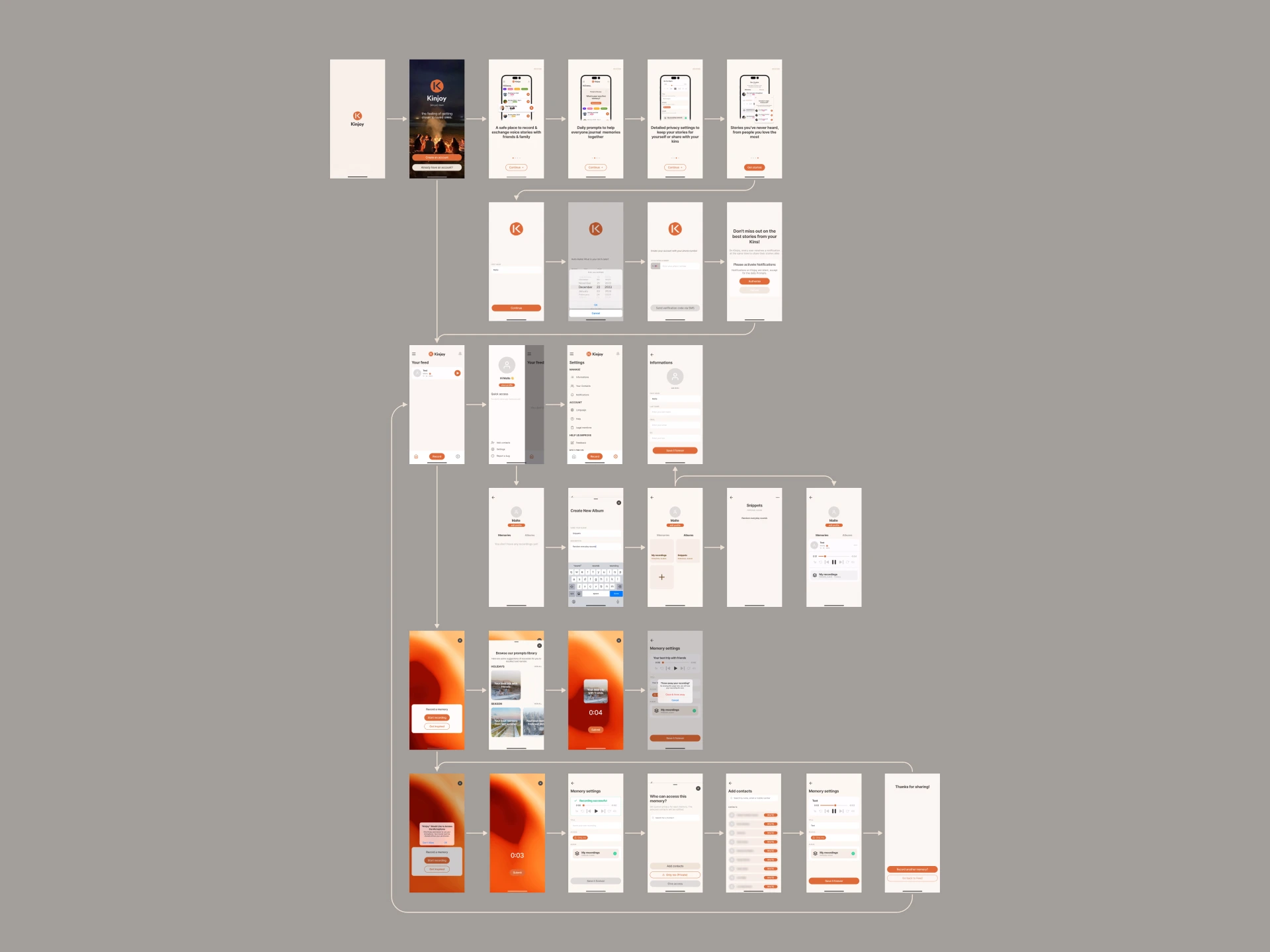
Mid- and low-fidelity prototypes
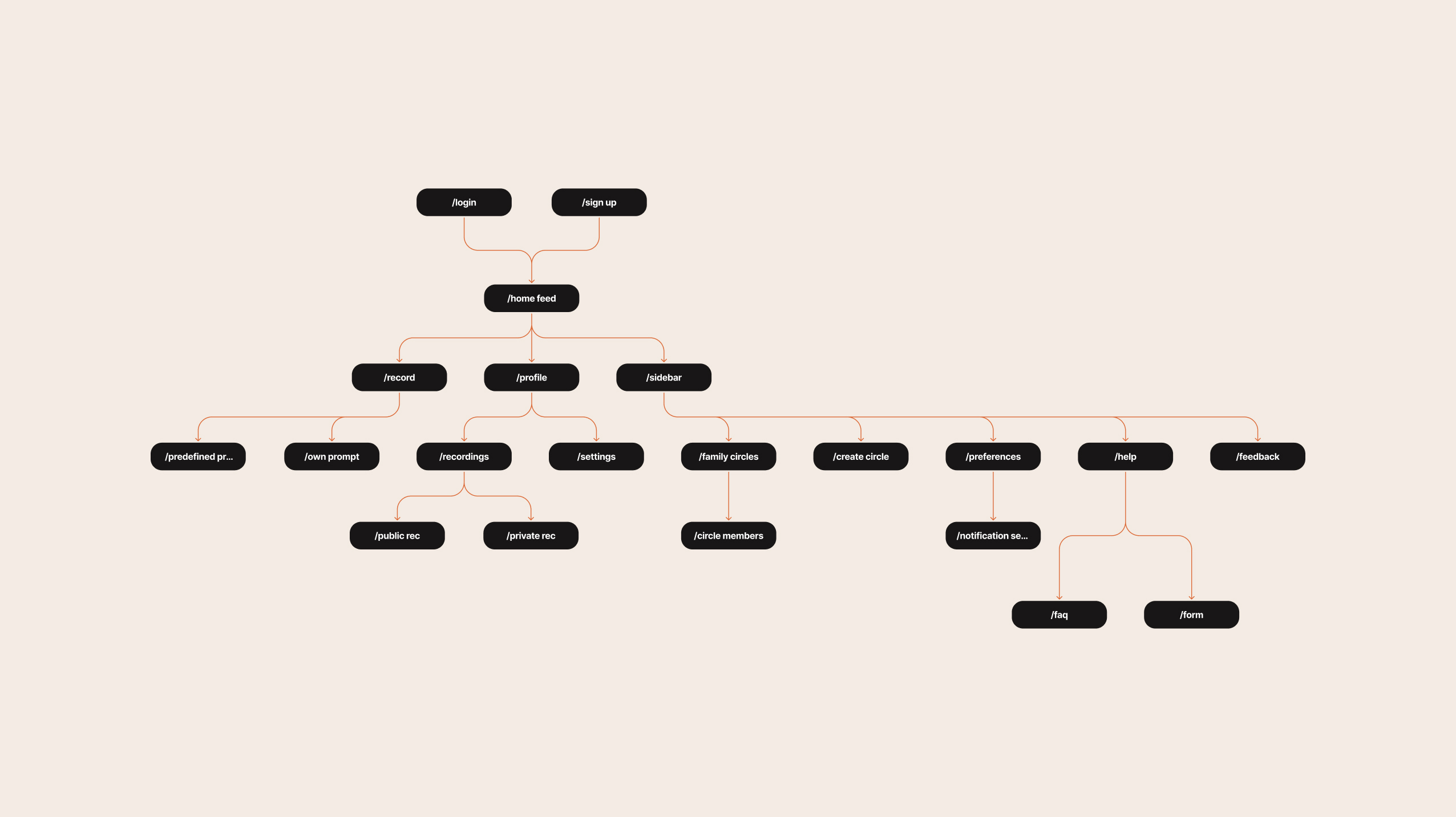
While I was developing Kinjoy’s brand identity, the UX designer took a lead in the creation of low- and mid-fidelity prototypes. By July, we had established clear user flows, which really sped up the process. However, the approach left little room for experimenting with unique interactions that could truly embody the essence of the Kinjoy brand. Ideally, the brand identity and prototypes would have evolved through a more dynamic exchange between the two design processes. The UX designer looked to established platforms like Discord and Spotify for inspiration and by drawing on Discord’s sidebar structure, the design aimed to create an intuitive navigation system, allowing users to move between sections of the app and view profiles with ease. Similarly, elements of Spotify’s filter bubbles were adapted to visually organize shared memories, helping users clearly distinguish which memories were shared with which groups. This design approach helped minimize the risk of accidental sharing and ensured a seamless and familiar experience. As the design progressed to mid-fidelity, the focus was on enhancing both usability and visual clarity, while encouraging user interaction. The iterative nature of the process, supported by user feedback and insights from successful platforms, ensured that these prototypes reflected Kinjoy’s core objectives, blending functionality with an engaging user experience.
The design system
While I find it exciting and rewarding to build the real thing right from the outset and skip prototyping altogether, this approach isn’t always practical - especially when you're working together as a team, testing with users and dealing with clear requirements and deadlines - prototyping is no doubt a far more efficient method. The visual identity - the logo, the responsive typographic system, color palette and icon system - provided a strong foundation for the development of the design system we needed, to build the final high-fidelity prototype. In a matter of days I unfolded the atoms of the identity into reusable molecules and organisms: an on-brand, adaptable component library in Figma.<br><br>
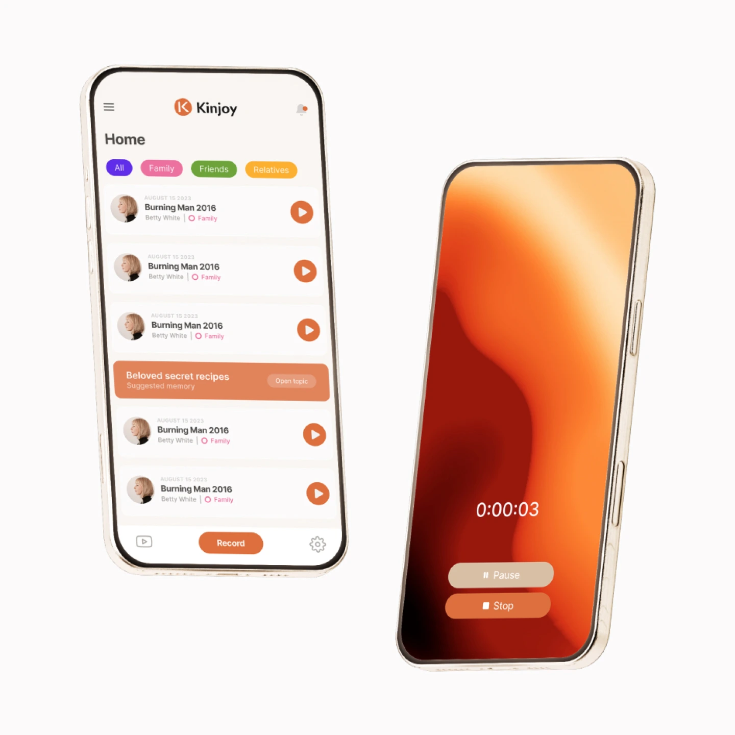
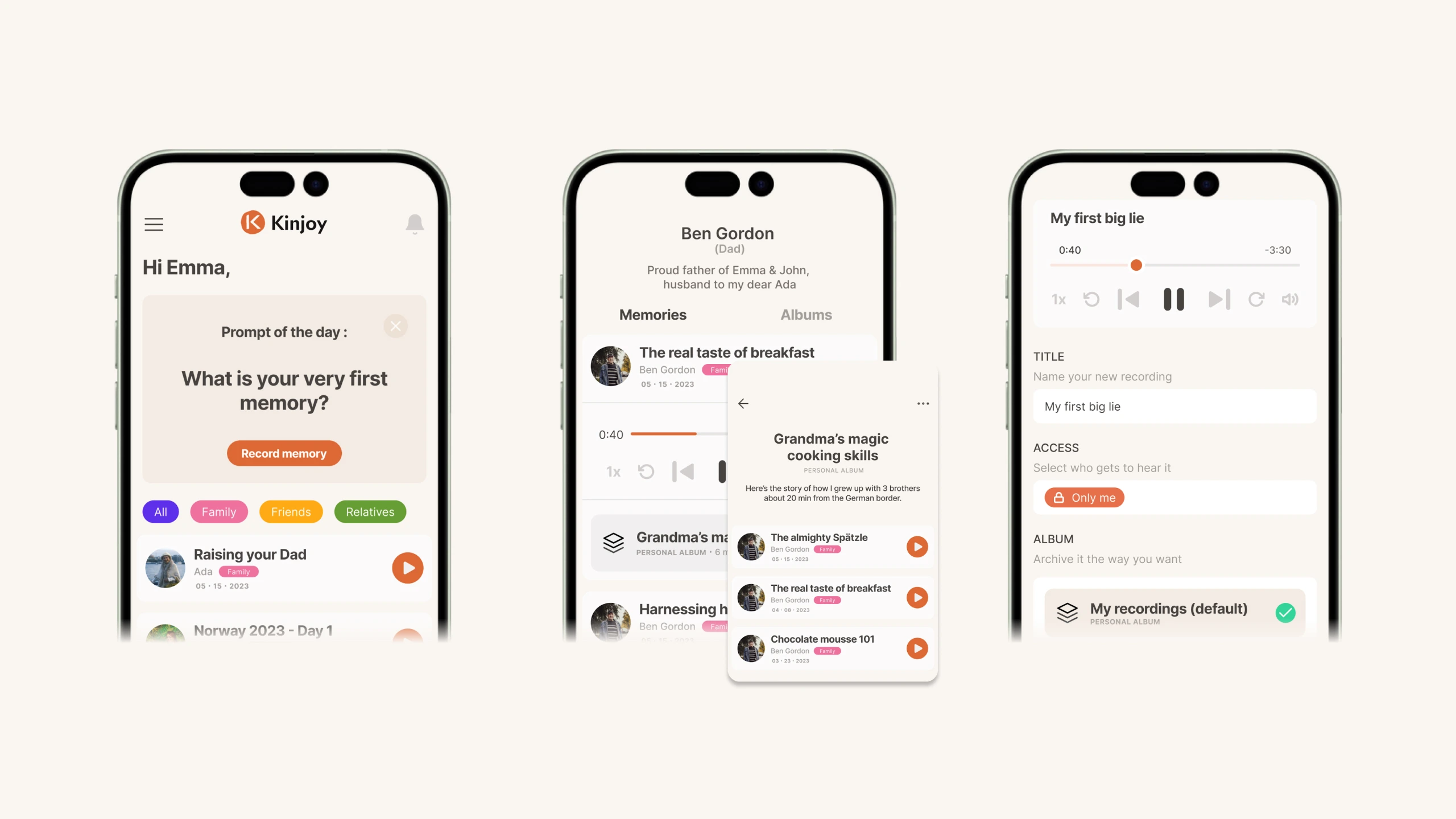
High-fidelity prototype
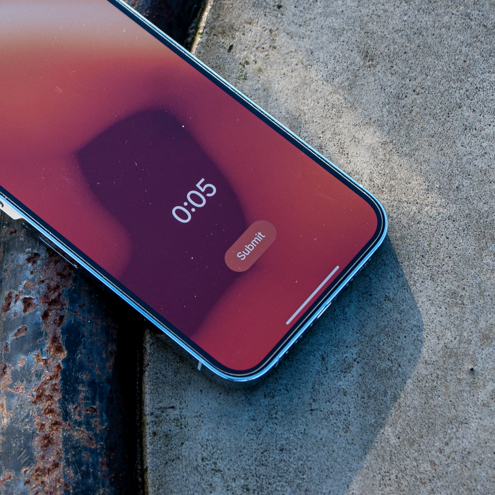
With 90% of a design system in place and the fleshed out mid-fidelity prototype for reference, we started building the high-fidelity prototype. The process was almost linear and especially the visual hierachy for the recording screen helped speed up the development of other components.
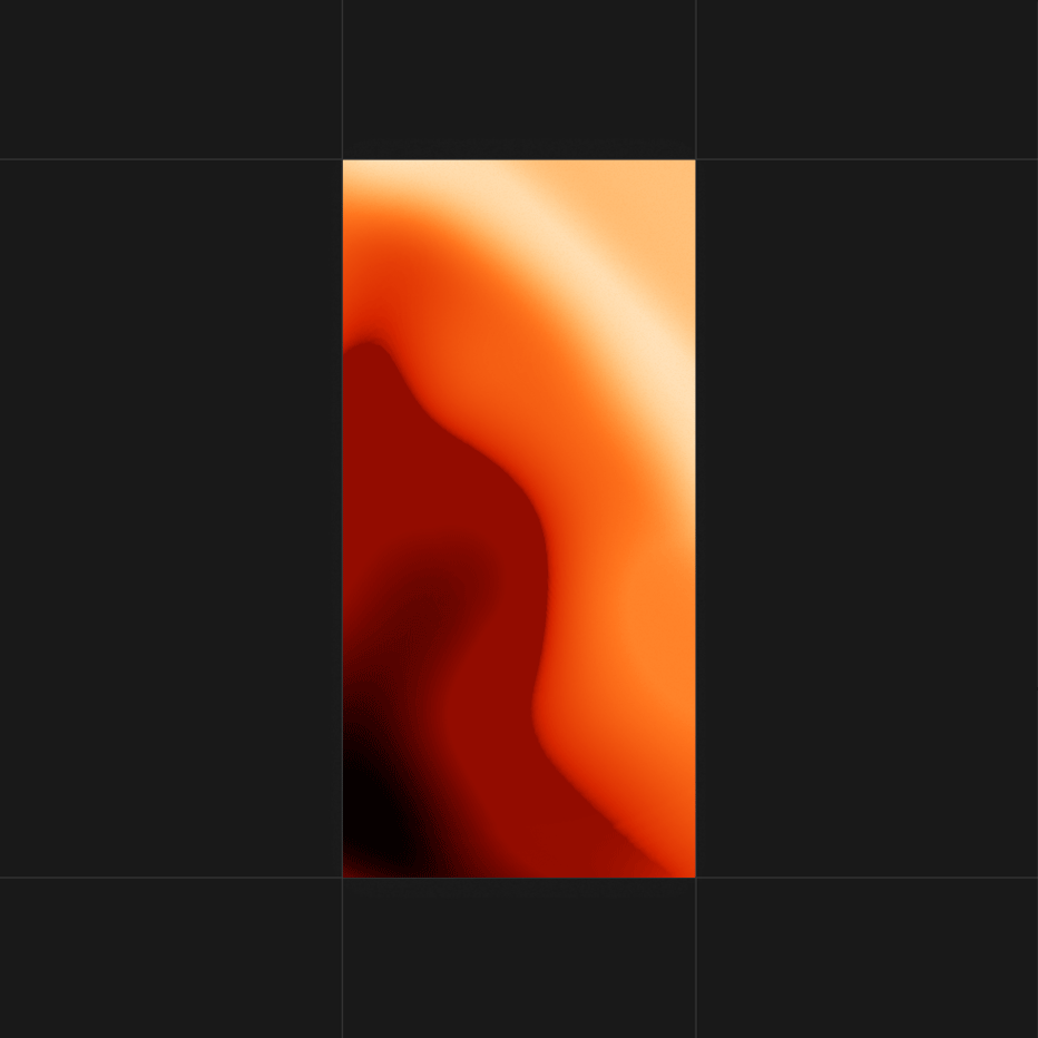
Fire animation
While the hi-fi prototype neared its completion I turned my attention to a key-visual of the Kinjoy brand: the moving visual that would occour as users record memories. During the previous process we had agreed on an abstraction inspired by the camp fire. I created various sound-reactive sequences in Cinema 4D and even a stop-motion gif using orange gaffer tape, but eventually arrived at a motion sequence creted with Photoshop. The composition simply consists of stacked layers moving and rotating evoking the movement of flames or waves on fire. This visual was implemented as the placeholder for the next, sound-reactive version.
Landing page
In September, before our landing page, www.kinjoyapp.com, went live I rendered a basic hero visual in Cinema 4D consiting of two floating phones featuring the recording screen and the home screen. Aparently the landing page was the last step for Kinjoy to enter into the Apple Developer Program, after which the MVP app would be developed and the beta tests started.
Kinjoy - The Company and the Core Challenge
All the pieces had come together: the hi-fi prototype, the design system, and the visual identity had formed a solid basis for moving forward with back-end and front-end development. I was particularly excited to start collaborating with a front-end designer, engaging in the iterative back-and-forth process I’ve previously experienced when bringing a product to life. However, just as the project was about to advance, we experienced an unexpected situation. The UX designer and I was asked to transfer ownership of all our design files and shortly after, it became clear that Kinjoy had been registered as a formal company about a month earlier — without the team’s knowledge. This moment highlighted the core challenge of the entire project: despite the team’s collective efforts to create a unique, user-friendly, and engaging product, the lack of legal, foundational agreements ultimately led to confusion. The issues stemmed from several factors. First, we hadn’t established any clear, formal agreement regarding our roles and responsibilities as business partners. Second, our team lacked the necessary experience to foresee the importance of such agreements, leaving us vulnerable. Lastly, there was a significant communication gap when it came to major developments — such as the registration of the company, securing a domain name, or obtaining a DUNS number. Critical steps like these were taken with little transparency, and ultimately the collaborative spirit that had been the major driver of the project suffered greatly. In retrospect, the experience underscores how essential it is to establish clear legal and organizational structures from the very beginning start - however boring or time consuming it may seem. While the creative and technical process went smoothly, the lack of transparency and legal foresight provided us a major lesson about what goes into continous, successful team ventures.
Kinjoy - MVP Development, Incubation and Beta Test Invites
Within the next four months, significant progress was made on the project. The business was registred with the Apple Developer Program, which was a crucial step for moving forward in the app development process. Additionally, a developer was brought on board to build the Minimum Viable Product (MVP), using the designs and concepts we had previously developed. By December, the project took another leap forward with the addition of a beta test sign-up form on the landing page. Beta test invitations were distributed through LinkedIn and X, reaching potential testers and early adopters. Around the same time, Kinjoy joined an incubator program at South Park Commons in NYC, which was a major leap in gaining further support and resources. I was excited to receive a beta test invitation through TestFlight, as it provided an opportunity to see how front-end had translated our design system and ideas into a functioning app. Eager to assess the implementation, I tested the app and recorded my feedback focusing on strengths that could be enhanced and how well the design and functionality aligned with our brand and original concept.
3 months into betatesting - the first user feedback
By March 2024, the app had been in beta for three months. During this period, it had attracted approximately 100 monthly users and had 187 recordings created. Several factors influenced the figures: out of about 80 people on the waitlist, only around 20% had downloaded and used the app, with the remaining users arriving through organic growth. The beta testing process through Apple’s platform, which required downloading TestFlight, had proven to be a barrier for many users. Not only did it deter potential users but it also impeded organic growth, as the app was not yet listed on the App Store. It was available on the Google Play Store as a test version. Despite these challenges, the app had performed reasonably well, particularly considering that its promotion had relied solely on word of mouth. The beta phase had been instrumental in gathering feedback on user experience and interface design, revealing critical areas for improvement and identifying major bugs. Plans were in place to address these issues in the next version, scheduled for release around the end of April. Furthermore, user interviews had begun in February, with 13 interviews conducted by that time. These discussions had explored significant issues related to memory conservation, family relationships, and personal identity, providing valuable insights into the challenges users faced and guiding future enhancements. Very soon, Kinjoy was incubated at Kedge Entrepreneurship.
Copyright © 2025. Awerture c/o Malte Simon. All rights reserved.
Mode of Operation: Sole Proprietorship. CVR 42202843