Deep - designing an identity and interface for the future of business growth and engagement.
During Deep’s early stages in 2020 I collaborated closely with the founder to create an identity, a landing page and the core digital product. I designed a bespoke typeface, Deep Sans, the logo, iconography, color and type hierachies. Collaborating on user flows I moved on to create the design system and UI for the digital platform, which I revised in 2023. A comparative analysis conducted in 2021 demonstrated that onboarding the platform is 30X faster and delivers a 90% cost reduction compared to the closest competitors.
UI/UX
Prototyping
3D
Identity
Digital Product Design
Project insights
Overview
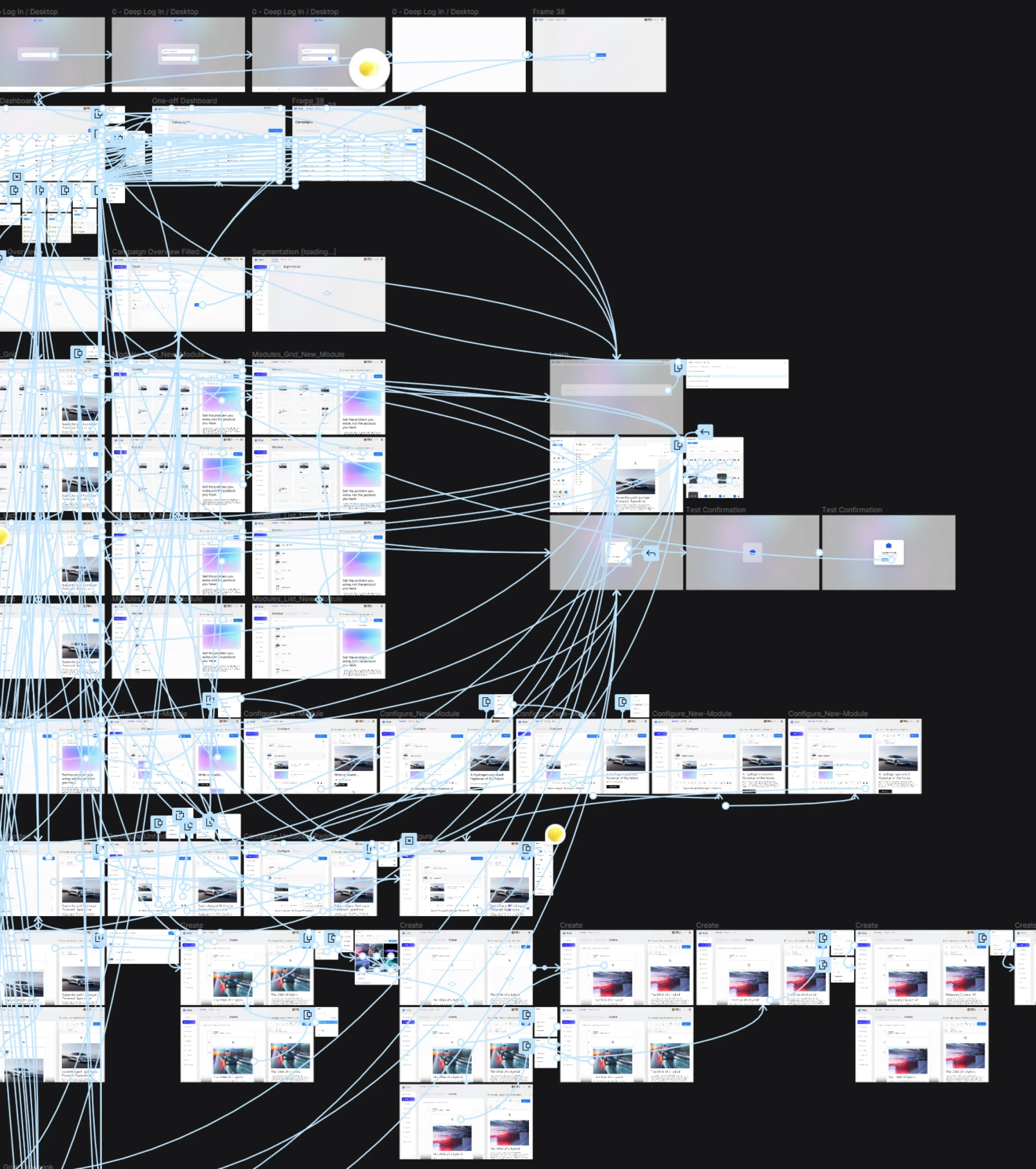
This short study highlights the design process and outcomes of a comprehensive digital product project for Deep. It builds on the foundational work of designing the brand identity, which included custom typography, logo, and a complete visual identity system. While the branding process is not covered here, it very much informed and influenced the product's design language. The journey encompassed ideation, design system construction, interactive prototyping, and promotional materials, which goes to showcase the intersection of design methodologies, experience, and technology.
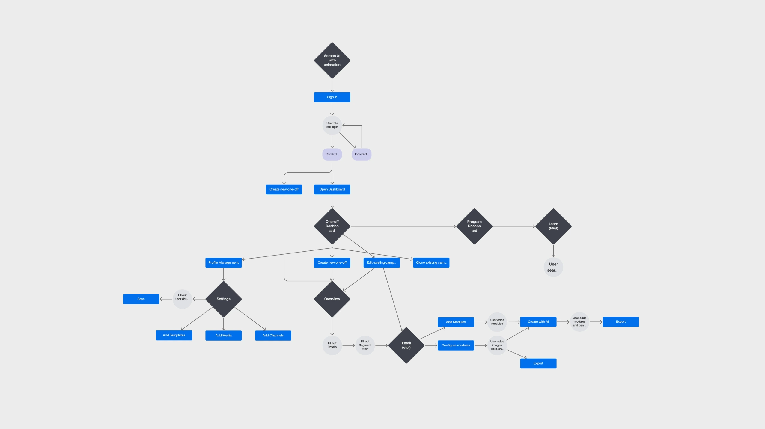
My Figma workspace setup
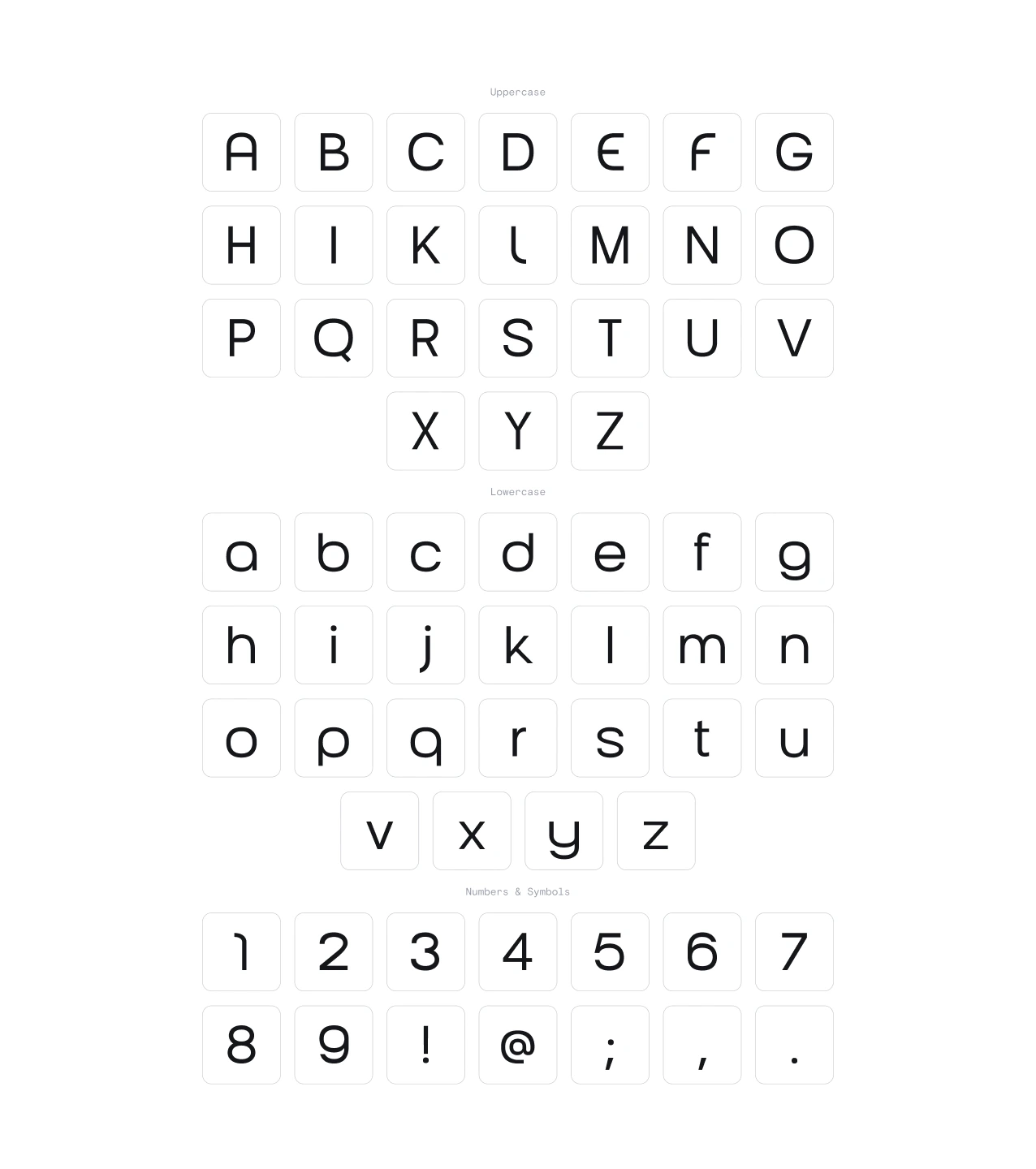
The project began by structuring my workspace in Figma, dividing it into three pages: Exploration, Design System, and Flows. The Exploration page captured the brief, links, and platform documentation. Five videos documenting distinct user flows were reviewed, and relevant screenshots were added to the Flows page. To refine the platform's visual language, I explored replacement typefaces for Freight Sans by Joshua Darden. This search led to selecting Aeonik, a modern and versatile typeface by Mark Bloom and Joe Leadbeater.
Moodboarding and Early UI Concepts
To establish a cohesive aesthetic, I developed a moodboard and explored animations for the logo and loading screens using Cinema 4D (C4D). Concurrently, I researched colors and started crafting 3D icons. The exploration phase methodically addressed key questions outlined in the brief, documenting the current state and then using this as a starting point for each design element.
Feedback and Iterative Refinement
Meetings in-person provided an opportunity to present an initial login flow and design concepts. Feedback emphasized replacing 3D icons with flat line icons for consistency and simplicity. The client appreciated the login animation and its soft-body swirling background, suggesting its extension across the platform.
Prototyping and Interactivity
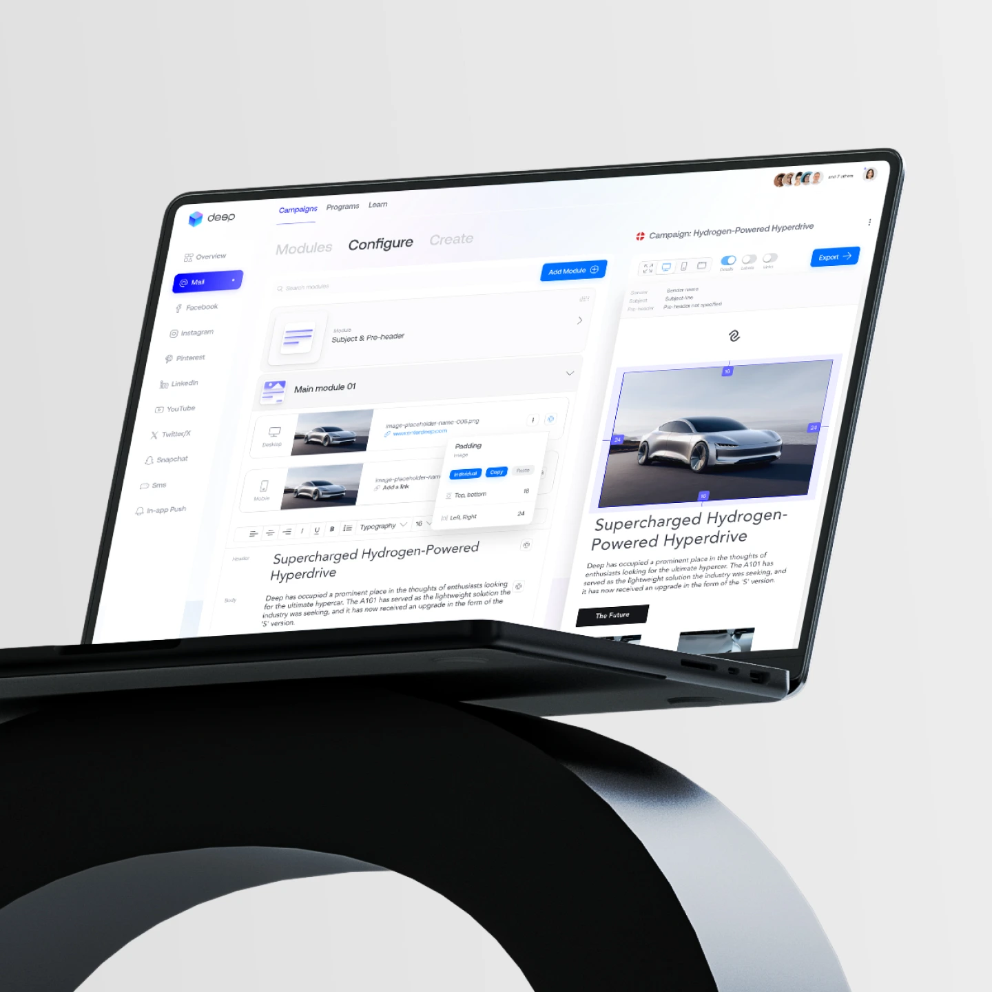
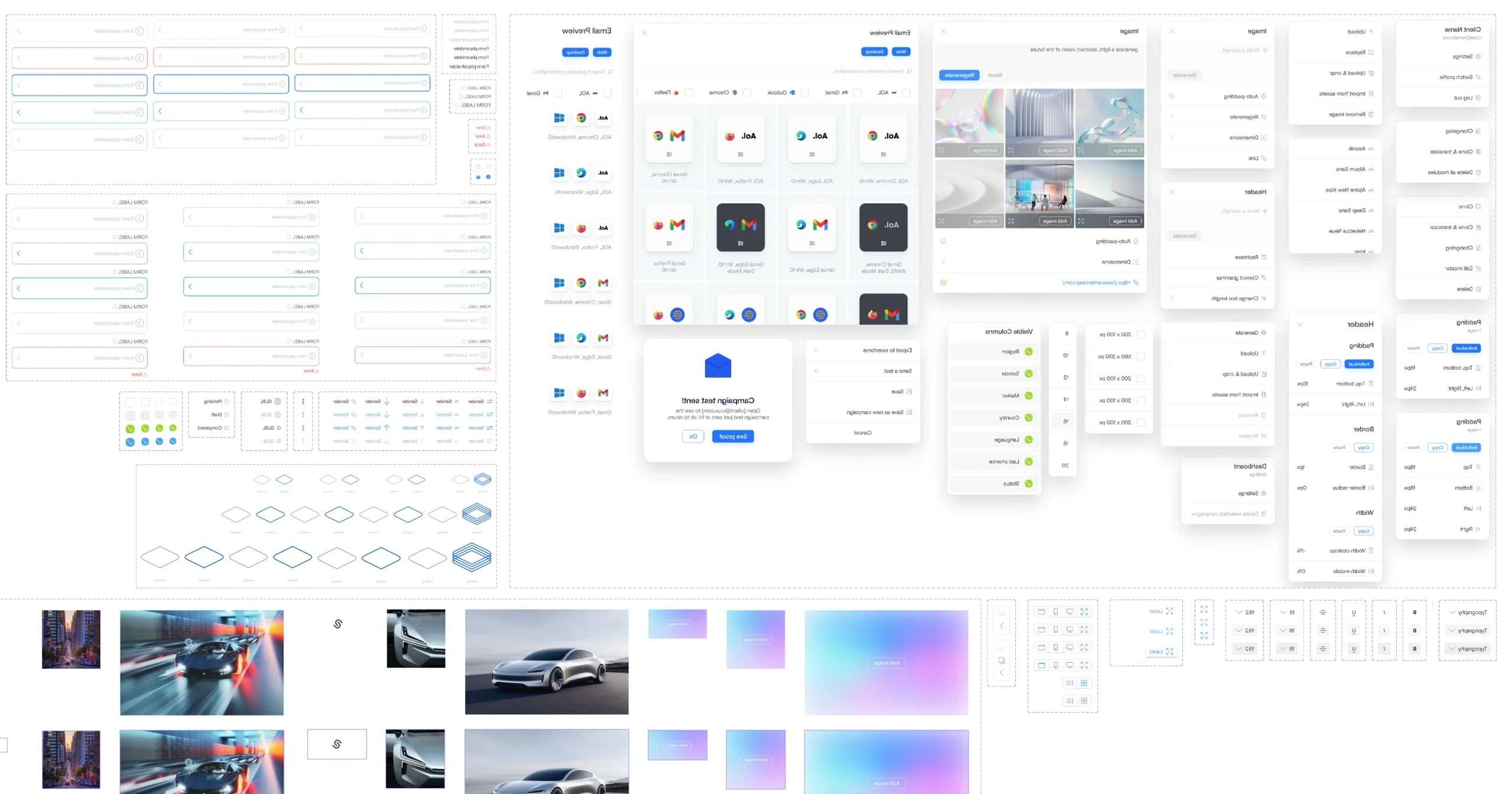
Building on a nearly finalized design system, I began prototyping and adding interactions in Figma. The interactive prototype, shared via a recorded video and live link, received excellent feedback. This success enabled me to move forward with creating motion mockups and promotional visuals that abstractly represented the platform’s core flows and branding.
Final Adjustments and Deliverables
Additional feedback led to enhancements like side menu icons and preview pages. I refined these elements, updated the Figma files, and created mockups from promotional video stills. The final deliverables, including a short film and project presentation, were submitted and well-received, with minor adjustments requested later.
Methodology
The project exemplified the integration of tools like Figma and C4D to deliver high-impact results. Figma supported organization, rapid iteration, and seamless collaboration with the client and in-house developers. Cinema 4D facilitated the production of editorial-style promotional motion content in a tight timeline (2 weeks). The resulting digital product was met with high praise from the development team and stakeholders.
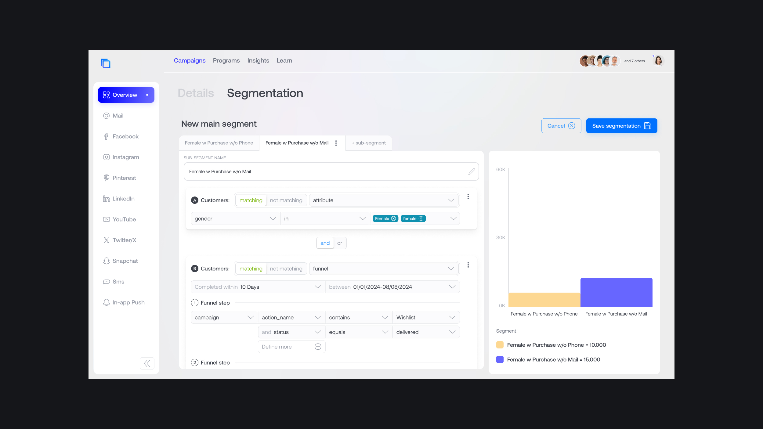
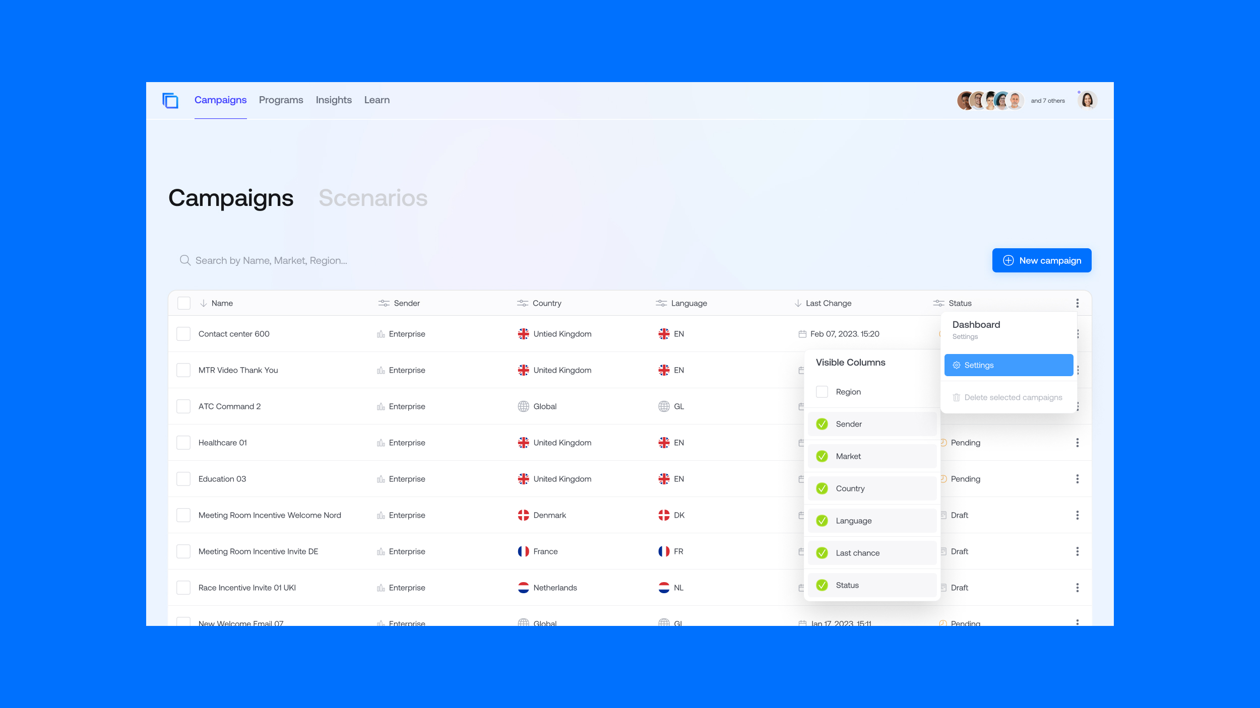
Expanding Functionality: Filter-Based Segmentation
A subsequent phase of the project focused on enhancing the platform’s segmentation capabilities. The goal was to introduce conditional filtering, enabling clients to create custom customer segments for improved analysis and campaign targeting.
Design Challenges and Insights
Primary references in the form of competitors segmentation flows, felt outdated and cumbersome and relys on a multitude of drop-down menus. My initial design proposal offered a more streamlined and user-friendly approach but initially faced feasibility constraints from the backend team. Guided by the teams feedback, I iteratively refined the design to balance usability and implementation feasibility.
Final Solution: Continuous Filter Design
Reimagining the filter interface as a continuous piece of text, rather than disjointed boxes, was pivotal. This approach integrated contextual words into dropdowns, used color coding for clarity, and allowed individual filters to collapse. These improvements significantly enhanced the user experience while maintaining alignment with backend requirements.


Explore

Interface for Salesforcecreating a visual universe and landing page for a high-speed SaaS
Deepdesigning an identity and interface for the future of business growth and engagement
Interstellar Labdesigning the interface for a new era of multiplanetary biofarming
Kinjoybuilding and launching an app to capture memories and preserve the voices of our friends and family
Pandora Hintimagining a subtle way to hint a significant other
Ambientmanifesting a magazine that reflects global perspectives on ambience